
Abstract
While most aspects of web accessibility are technically easy to solve, providing accessible equivalents of data visualizations for blind users remains a challenging problem. Previous attempts at accessible equivalents focused on sonification of population data. This paper describes the creation of two prototypes for providing real-time weather information in a sonified format for blind users. A structured requirements gathering using interviews and surveys led to the development of the first sonification prototype using both keyboard and touchscreen (with a tactile overlay) access to weather data on a PC and Mac. This prototype was evaluated for usability by five blind users. Based on the feedback from the usability evaluation, a second prototype on a new platform (Android tablet computer) was created. We discuss the development and evaluation process for the sonification prototypes, with a detailed description of the usability evaluations performed in the field. The studies show that when working at the intersection of users with disabilities and new technologies, it’s important to be flexible and adjust quickly to get the most out of field studies.
Tips for Usability Practitioners
When performing usability testing involving people with disabilities, we have the following suggestions:
- Know the characteristics of your participants that might make logistics more challenging. For instance, in this and previous studies, we have talked about the blind participant’s need to plan their transportation in advance. In another JUS article, we talked about making sure that participants with intellectual or cognitive disabilities bring their passwords with them in case they forget the passwords (Kumin et al., 2012). Certainly, for participants in wheelchairs, you would want to make sure that the physical spaces that you would utilize for usability testing (hallways, doorways, elevators, bathrooms, offices) are fully accessible.
- Be clear about the type of participants that are the focus of your research. There is often a wide level of variability in the computer skill level of people with disabilities. In previously published JUS articles, we have discussed the extreme variability of skill. In this study, due to the nature of the application being developed, we were looking to recruit highly advanced computer users. Yet for other studies, for applications geared towards a more general audience of users with disabilities, there will be a broad range of skills. It is important to be very clear about who is the target user population—all users with a certain disability? Introductory users with a certain disability? Advanced users with a certain disability? What about people with multiple disabilities? Can they be included in your research?
- Do multiple pilot studies and multiple technical checks—whenever possible. Because this study was not funded, we did not have the resources to implement this tip. We could not do multiple pilot studies. We only did one technical check a week before the usability evaluation, and that alone was not sufficient due to new security patches installed at the location of our usability testing.
- Be willing to be flexible and to quickly make modifications. One of the reasons to do usability testing is because you are interested in practical feedback, not tight control. Embrace that flexibility, as learning something by observing users, even in a limited fashion, is better than learning nothing. In previously published JUS articles, we have discussed the need to be flexible in providing interventions when there are major accessibility roadblocks that would otherwise allow for no feedback (Lazar, Olalere, & Wentz, 2012). We needed to be flexible when participants want to change one step in a task that didn’t impact what we were studying (Kumin, Lazar, Feng, Wentz, & Ekedebe, 2012). In this current study, we needed to be flexible when technology didn’t work and when participants could not be rescheduled.
Introduction
In recent years there have been significant advances in developing websites that are accessible for individuals with disabilities. The Web Content Accessibility Guidelines (WCAG) from the Web Accessibility Initiative (http://www.w3.org/wai) provide clear standards for labeling visual images: providing equivalents for mouseovers, labeling forms and tables, and providing accessible equivalents for video and audio. Many countries have legal guidelines related to web accessibility, and most national government guidelines tend to be based on the WCAG (Meiselwitz, Wentz, & Lazar, 2010). However, one of the more challenging aspects of accessible web design is coming up with accessible equivalents of data visualizations that can be effectively used by blind users. Data visualizations are typically used to improve comprehension of large quantities of data as vision allows for the perception of large quantities of spatial information quickly (Fritz & Barner, 1999). A central challenge in web accessibility is devising alternative modes of representing such visual data, which frequently does not easily translate into textual equivalents, on web pages for blind users. While an important topic, there have not been many research projects performed about the accessibility of data visualizations.
It is important to note that users’ terminology differs depending on their country and professional training. In the context of this work, the term “blind users” has different meanings. For instance, in the US, “blind users” often refers to anyone with any type of visual loss; whereas in the UK, “visually impaired” is often used to describe people with low vision, while “blind” is used to describe someone with no useful residual vision. In this paper, the term “blind” refers to people with no residual vision; they rely strictly on tactile materials and sounds (typical non-visual approaches), not vision.
Accessibility researchers have proposed that equivalencies may be accomplished through a multimodal approach such as haptic visualization, force feedback, and/or sonification (Fritz &Barner, 1999; Su, Rosenzweig, Goel, de Lara, & Truong, 2010). Haptic visualizations use the sense of touch by applying forces, vibration, or motion to a user. Force feedback is a particular form of such haptic feedback. A typical example would be vibrating cell phones when ringing or touchscreens responding with vibrations when a user performs particular actions. Sonifications, on the other hand, rely on sound based feedback to user actions.
One of the co-authors of this paper (Lazar) had previously worked on a sonification project, and based on that project, a local Maryland resident, who is blind, contacted our team about working on developing better access to weather maps for blind users. This study describes our response to that request: requirements gathering, usability evaluation, and iterative design of sonification for blind users to understand weather map data.
Maps represent a very common visualization approach on webpages. Figure 1 (adapted from www.recovery.gov) shows a typical example of a data visualization that is based on a map. A quick visual map sweep of Figure 1 allows users to see that the states marked with darker colors have a higher percentage of residents under the age of 18, and those states tend to be clustered in the southwest part of the United States. Equivalents of visualizations for blind users tend to provide a table of data presented on the map (Plaisant, 2004), which while technically equivalent, does not allow for quick map sweeps to obtain an overview of data that is the key first step of usage of information visualizations.

Figure1. Map-based visualization of population data (darker states have more residents
under 18)
Previous research has addressed this problem through the development of sonified maps that used non-textual audio output to allow users to comprehend detailed as well as trend data rendered within maps(Zhao, Shneiderman, Plaisant, & Lazar, 2008; Zhao, Smith, Norman, Plaisant, & Shneiderman, 2005). In this study, we build on existing research to investigate the use of sonification to represent weather map data for blind users. The specific goals for this study were to (a) perform a requirements gathering to learn more about how blind users seek information about weather, (b) modify an existing sonification application that was designed for population statistics to provide live feeds of weather data in a sonified format, and (c) evaluate the new application with a sample of blind users.
The rest of the article is organized as follows. First we describe additional research and applications related to sonified maps. Next we describe our methodological approach in requirements gathering, and developing and evaluating a sonified solution for providing accessible map-based data for blind users. Finally we discuss the implications and future development and research directions.
Literature Review
When websites follow a series of accessibility design guidelines, such as the WCAG, the implication is that the websites will work for most users with perceptual and/or motor impairments, including blind users. However, information visualizations on web pages continue to be inaccessible. Visualizations are inherently directed at sighted users and developing an equivalent rendering for blind users is not a trivial problem. In the past, researchers have investigated the potential use of sonification, of non-textual sound, to represent an equivalent for visualizations (Pauletto & Hunt, 2009; Walker & Mauney, 2010; Yoshida, Kitani, Koike, Belongie, & Schlei, 2011; Zhao, Shneiderman, Plaisant, & Lazar, 2008; Zhao, Smith, Norman, Plaisant, & Shneiderman, 2005). Wall and Brewster (2006) noted that tactile printed media (such as a raised bar-chart printout) are insufficient options due to the limited amount of data that can be presented in a printed manner, and they are rarely used (or even available) after primary schooling. Wall and Brewster also noted that the talking tactile tablet was a useful approach for blind users because it combines a touch tablet with a tactile overlay. Tapping on specific regions of the tactile overlay results in speech output that provides details about the selected area (Wall & Brewster, 2006).But again, there is limited availability of tactile overlays, especially for complex data situations.
A flexible, scalable equivalent for visualizations is needed for blind users. There is a need for the ability to drill-down to specific data values (Wall & Brewster, 2006), which is a key part of the common approach to information visualization (Shneiderman & Plaisant, 2010).In visualizations, users first get an overview of lots of data points, looking for patterns at a high level and looking for exceptions that are not within the same trend (e.g., a stock that went up 50% in a single day). Users can then access details on demand (“drill-down”) about the specific item that seems to be an outlier (such as more detailed information about that one specific stock).Visualizations are highly effective in dealing with scalability of data. While you might be able to spot a trend or an outlier in a spreadsheet of 25-50 data items, it is much harder to spot trends by reading numbers, once you have 100, 1,000, 10,000 or more data points. When a website has visualizations and is legally required to be accessible, government regulations related to web accessibility can be met by simply providing a link to a downloadable table of data that blind users can manipulate using whatever tools that they prefer. While this meets government requirements and allows blind users to access the data, there is a need to develop new interface approaches that allow for the same flexibility for analyzing large sets of data using flexible tools. So far, these tools have taken the form of non-textual sound, known as sonification.
Two existing sonification tools are iSonic (http://www.cs.umd.edu/hcil/audiomap/) and Earth+ (http://prime.jsc.nasa.gov/earthplus/).We call these sonification tools, because they represent attempts to render sound-based equivalents of the visual map-based information. The iSonic tool was originally created as a graduate project at the University of Maryland and allows blind users to hear population trends and patterns on a map of the United States. At a very basic level the application uses pitch of sound to provide a user with an overview or trend about population within a geographical region. In other words, when using iSonic, blind users can navigate (using a keyboard or a touchscreen) to individual states within the map of United States and get audio feedback about the state name and population characteristics. Further, iSonic also allows blind users to develop a sense of population trends. This is done by mapping varying pitch of sound levels to population levels. This allows a user to rapidly navigate (using a keyboard or a mouse) across the different states to get a sense of the increase and decrease in population figures through the patterns of waxing and waning of the pitch. For example, a user would hear high pitch sounds for the states on the coasts and lower pitches around the mid-western and mountain states. The iSonic tool also provides alternative map views of data that include a broader regional view and also a view down to the state and county level.
Earth+ (developed by NASA in 2005) is another tool that we evaluated. Earth+ was a NASA project with similar aims at developing accessible map representations. However that tool was not developed beyond a prototype and is therefore somewhat limited in terms of functionality. The application allows a user to explore an image based on the color palette that defines it. The exploration can be done by placing the cursor at various points within the image; the software then emits a piano note at a pitch unique for that color. This allows a user to gauge the color composition and distribution within an image. Earth+ had a number of preloaded map images that used conventional color-coding to provide visual information but can in principle work with any image. While we appreciated the principle behind the Earth+ implementation, we felt that the tool had some limitations. First, the mapping of sound to color is not very efficient for maps as a user would (a) need to remember the key to sense the color changes and (b) need to do two levels of translation from the sound to color and then from color to map attributes (e.g., temperature, population, etc.). Second, there is insufficient sonic feedback about navigation. For example, if a user moves off the image, the tool does use auditory feedback to inform a user, but the feedback is not instantaneous and does not provide enough feedback of such events. That issue becomes a concern for map-based images, because the feedback a user receives when crossing boundaries within the map is erratic if a user makes quick movements, and the feedback is also less responsive for states with smaller areas (e.g., such as Rhode Island or Delaware).
Given the exploratory nature of our study, we felt that iSonic would require the least customization to fit our context and would be the most useful. We received permission from the University of Maryland, owners of the iSonic application, to continue developing it.
Requirements Gathering
To modify iSonic for blind users to access new weather data, we needed to understand how blind users access that information.
We were motivated to answer the following questions (the first three questions relate to general aspects of map design and technology, and the fourth and fifth questions are specific to the requirements of blind users):
- What are the different aspects of weather that could be rendered in such a map?
- What resources are available to provide the underlying data feeds to keep the map data up to date?
- What would be the most appropriate interface technology for such a weather map?
- What information would a blind user typically desire in a weather map?
- What would be the best way to present weather information to a typical blind user?
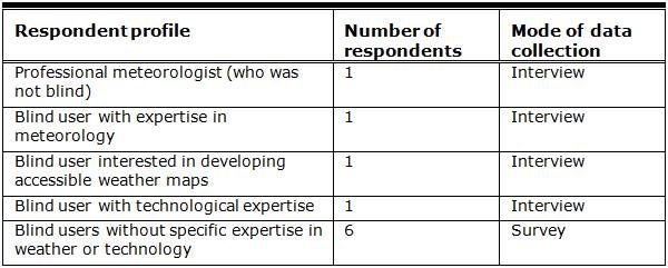
Our data collection was greatly facilitated by our access to a diverse set of users within the blindness community; this is due to a number of factors. Our original user, who contacted our group about developing weather maps that they could understand, suggested the names of people that we could contact. Also, one of the co-authors (Lazar) of this article has long-standing collaborations in place with the organized blind community in Maryland. Our sample of respondents included some individuals who had (a) expertise about the domain of interest (meteorology), (b) a high level of motivation in helping develop and using sonified weather maps,(c) expertise on contextually appropriate assistive technology, and (d) an interest in gaining weather related information but moderate to low technological and domain related expertise. Table 1 below provides details about our participants and the data collection approach. Our data collection was done using a combination of interviews and a survey questionnaire. Respondents for the interviews were identified both using contacts of one of the authors and also through a snowballing technique. For example, the meteorologist and the blind user with interests in development of accessible maps were already known to one of the authors. The other two blind individuals with expertise or interest in meteorology and technology were suggested by our first blind interviewee. The survey was developed after the interviews. The survey was sent to a National Federation of the Blind mailing list. We employed face-to-face interviews for all preliminary interviews, with some follow-up interviews done over the phone. Our interviews and surveys were focused on obtaining an understanding about the features that would be considered useful in weather maps, the nature of weather data that would be considered useful, and the modes of interaction that would enhance a user interaction with the interface. The Appendix has the survey questions used to gather the requirements.
Table 1. Respondent Profile
The interviews with the expert blind users and the survey responses of the non-expert blind users provided valuable input for the development of our prototype weather map, including the nature of weather related information expected by blind users, the most useful representations of such information, and the modes of interaction that would be considered helpful. In addition to the interactions with blind users, our data collection also involved an interview with a meteorologist from the National Oceanic and Atmospheric Administration (NOAA) who is not blind. That interview provided valuable directions with regards to obtaining continuous live weather data feed for the application from NOAA websites.
After the collection and analysis of interview and survey data, we created a series of user scenarios to obtain a clearer understanding of what the proposed application could be expected to do. The scenarios proved to be helpful in narrowing down and creating a focus for what the prototype should do and how it should do it. We created these scenarios to explicitly map out how a user would go through the prototype for related tasks, what these tasks would show, and what types of outputs they would have. An example scenario is included below.
Scenario: Checking Maryland Temperatures in iSonic
A user opens iSonic from their desktop application. The Maryland map opens with a drop-down menu to choose a type of weather information. A user then chooses the temperature selection. Once this is chosen, the Maryland map refreshes with the temperature data downloaded within the last hour from the NOAA weather server. Once this information is available on the map, a user can hear temperature sweeps of the map or drill-down to specific data points for Maryland temperatures using either a touchscreen or keyboard. A high-pitched tone indicates a high temperature, and a lower pitched tone indicates a lower temperature. This allows users to determine weather trends across the state.
Based on the requirements gathering and user scenarios, we identified the following initial set of specifications for what the sonified weather map should provide:
- Provide weather information related to current and future temperatures, precipitation, and wind speeds.
- Allow users to obtain discrete weather related information for a geographical location (e.g., temperature in a particular city).
- Allow users to obtain trends with regards to weather related information for a geographical region (e.g., change of temperature within a state).
- Provide users with a sense of the physical geographical reference within the context of the map.
- Allow users to choose the nature of weather information and the level of detail for the weather information.
- Provide users means for multimodal interaction to enable perception of information through multiple senses (e.g., touch-based and audio-based).
- Be easy to use for users without access to sophisticated assistive technology.
- Be easy to use for users with minimal experience with assistive technology.
The above list of specifications provided the basis for the design of the prototype. In addition, we decided to develop the initial prototype only for the state of Maryland and the 24 counties within Maryland (Baltimore City is not in a county; however, it is usually counted demographically as the 24th county of Maryland even though it is technically not a county). Important distinctions that exist in other portions of the US, such as township, are of little importance in Maryland, where most governmental services (schools, police) are at a county level. We chose to focus on Maryland primarily because we thought that since all of our usability testing would be taking place involving Baltimore-area residents, they would be most likely familiar with the geography of Maryland, and that would allow us to focus more on the interface and interaction, rather than the level of geographical knowledge of an area that users are not familiar with. The specifics of our design are described in the next section.
Design of the First Sonified Weather Map Prototype
In the following sections we describe the details of the system architecture and user interaction to our first prototype.
System Architecture for Retrieving Weather Data
We built the accessible weather map by modifying iSonic. The iSonic application in its current version works with population data. It is designed to work with only static data and requires the source data to be in a CSV file format. While population data is updated maybe once a year, weather data is updated frequently, often hourly. For the proposed weather map sonification, we needed to modify the application to work with a real-time data feed.
The source for the weather data was the National Oceanic and Atmospheric Administration (NOAA) website, which is run by the U.S. Federal Government and therefore provides weather data to the public at no charge and with no permissions required. The NOAA website provides real-time weather data in raw textual format that met the information specification of the proposed weather application and was formatted for easy retrieval. The data querying was developed using Microsoft Excel macros that allow retrieval of external data from tables located on HTML pages. The weather data for the different counties within Maryland was retrieved through the manipulation of the longitude and latitude values in the data retrieval queries. This allowed the importing of weather data for multiple points in Maryland into an Excel workbook. The particular data points were developed through the compilation of a list of cities that were completely within the boundaries of each county, usually the county’s administrative center. We assumed that these cities would be representative of the weather within the county in most instances because most of these counties are not geographically very large.
We implemented the data feed from the NOAA web server to the iSonic map interface using the following steps:
- Developed an Excel sheet (described above) to import data from the NOAA web server.
- Created a second Excel workbook and formatted it appropriately to make it readable by the iSonic application.
- Linked the cells of the two Excel sheets so that the second Excel sheet could automatically pull data from the Excel sheet containing imported weather data from NOAA’s web page.
- Developed a java program allowing automatic storing of the data from the second Excel sheet as a CSV file. In addition, we created VBA macros for both Excel sheets that initiate a refresh, save, close window sequence.
- Created a batch file so that the weather data was automatically updated and converted into a file readable by the application.
Figure 2 shows the system architecture schematic for the data retrieval process. In the next section we provide descriptive details about user interaction with the iSonic weather map application.

Figure 2. System architecture schematic
User Interaction With the iSonic Weather Map
We developed the prototype iSonic weather map application by overlaying weather data on the native iSonic application. A consequence of using the native iSonic platform was that we were constrained to use the existing mapping between data and auditory feedback in this platform. This was clearly a trade-off. The mapping between data and auditory feedback was based on static population data, not frequently changing weather data. It is possible that another type of mapping would, from a usability point of view, have been superior for weather data. However, given the lack of funding for the project and the limited schedule, we decided that the prototype would be based on the existing iSonic application. While this represented a design dilemma, we decided to accept this as a constraint for this exploratory study and also to use this configuration as an opportunity to test the usefulness of the existing mapping.
We developed the first prototype weather map to provide a user with three different types of weather information—temperature, wind speed, and percentage chance of precipitation (see Figure 3 for the temperature example). We made a design decision to present a user with each of these types of weather related information individually (only one type of data per weather map screen) to reduce information clutter (this decision was based on the feedback received during the requirements gathering).Therefore, we designed the prototype weather application to allow a user to switch between three separate sonified maps that provided weather related information on temperature, wind speed, and percentage chance of precipitation, respectively. Figure 3 below provides a snapshot of the sonified Maryland map.
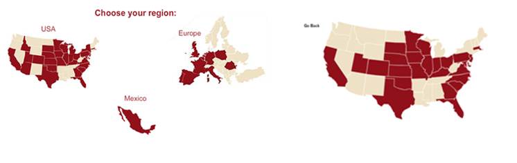
Figure 3. Prototype map interface (The counties with darker shades of green have higher temperatures than the counties with lighter shades of green.)
As mentioned before, the iSonic native application interface provided the environment for user interaction. The primary interaction mechanism in this interface is keyboard based. For the prototype and usability study, an additional interaction strategy was adopted. This involved using a touchscreen with a tactile map overlay to traverse through the iSonic weather maps. The tactile map had raised edges for the contours of map boundaries. The raised edges represented county borders within the state of Maryland. The tactile map did not have any braille. While the original iSonic application had the capability to use a touchscreen for interaction, the touchscreen capability had not been previously evaluated for usability (Zhao, Shneiderman, Plaisant, & Lazar, 2008). For this study, a KEYTEC Magic Touch touchscreen that was calibrated to the iSonic map application was used. The initial plan was to use a tactile map of Maryland manufactured by the National Federation of the Blind’s printing facilities. However, that tactile map did not calibrate to the scale expected by the touchscreen. To solve this issue, we created a tactile map by hand. We placed a piece of overlay paper on the touchscreen that displayed the iSonic map. We used a pencil to trace the map of Maryland from the iSonic interface to make a visual representation of the map on paper. Using needles (not near the touchscreen), our team “poked through” the paper and created tactile contours of the map boundaries using needles so that the map boundaries could be ascertained using tactile means. One of the challenges of doing so was that the overlay paper couldn’t just be any paper, but it needed to be paper that was thick enough to not rip but thin enough that the touchscreen could still sense human touch. The right “level” of paper, usable for tactile maps over touchscreens, was provided by the National Federation of the Blind.
The iSonic interface provides two information presentation choices (or data views) to a user. The first is the default map-based representation. The second is a tabular data view where the first column represents the geographical elements of the data (counties of Maryland in this instance), and the other columns represent the specific data domains being presented (e.g., temperature in Figure 4). Each row in this table represents the temperature, wind speed, and chance of precipitation for a Maryland county within an hour of the last data collection from the NOAA website. A user can switch between the two data views using the TAB key. The tabular data view allows a user to toggle between the three different weather maps (for temperature, wind speed, and chance of precipitation). For example, users can move from the temperature map to the wind speed map by pressing the TAB key. Users can switch from the map to the tabular view by pressing the TAB key too, and then press the arrow key to change the data focus to the wind speed column, and then press TAB again to move back to the map. Figure 4 shows a view of the tabular view showing temperature data for the Maryland counties.
Figure 4.Table view of the iSonic weather map
A user has two different choices of navigation through the map—absolute and relative. During both absolute and relative navigation, the map is traversed in units defined by the geographical boundaries of the Maryland counties. The absolute navigation, which is started with a simple key press (once started, the entire map is swept), allows a user to sweep through the map to get an overview of the values. This sweep is done left to right and from top to bottom. It is useful if a user wants a quick overview of the weather across Maryland. For example, if a user wanted to get an idea of precipitation across the state he/she would need to choose the precipitation map and initiate the absolute navigation. The iSonic application will start a sweep of the Maryland state, west to east and then north to south. As the sweep is made, a user will get feedback about the chance of precipitation for all the counties within the state. A user will also hear a percussion sound at end of each row of the sweep and a bell sound at the end of the sweep. Alternatively a user can perform a more controlled and detailed exploration of Maryland by using the relative navigation. For relative navigation, a user can press the four arrow keys to navigate up, down, left, and right in the map. By default the relative navigation commences from the left, top corner of the map. A chirping sound alerts a user when the navigation takes him/her outside the boundaries of the map (e.g., outside the boundaries of Maryland in this instance). As a user traverses through the state, they are provided auditory feedback about the weather-related data for that county. The relative navigation also allows a user to focus on a particular point of the map. For example if a user is interested in the weather in Baltimore County, they could traverse to the county and then get the specific weather details (temperature, wind speed, pressure, and chance of precipitation).
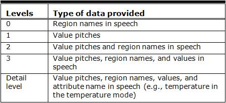
A user has the choice of receiving this feedback with different degrees of detail or information level. The least detailed is level 0, providing the name of the region (in this case, the county), but no data. Data level 1 provides a tonal sound to represent the data (e.g., the temperature), but no additional information. The pitch of this sound is used to represent values of the data, a higher pitch being associated with the larger value (e.g., high pitch for high temperature and low pitch for low temperature). Level 2 augments this tonal sound with speech output, such as the name of the county. Level 3 includes the pitch, the county name, and the temperature (or wind speed or precipitation) in the county. The level of information in the feedback can be increased or decreased by pressing the “+” key or by selecting the information level choice in the menu bar. In Table 2 we provide the details for the different levels.
Table 2. Feedback Levels
Therefore, users can navigate to a particular county and choose the level of detail they would like. For example proceeding with our earlier example, if users interested in weather in Baltimore County chose the temperature map and increase the feedback level to the detailed level, they would receive feedback that would inform them of the name of the county, the sound pitch corresponding to the temperature, value of the temperature (e.g., 32° F), and the fact that the specific weather attribute being referred to is temperature. On the other hand, if users wanted to explore the Maryland geography, they can choose level 0 and traverse the map using absolute or relative navigation. Similarly, users interested in temperature trends across the state could choose the temperature map and initiate absolute or relative navigation. The increase and decrease of the pitch as they traverse the map would give them a sense of the trend of temperature distribution in the state.
For this study, participants also used a touchscreen with a tactile map overlay to navigate the Maryland map. With this alternative, participants selected a particular county by tracing its contours on the tactile map and then tapped on it to get weather related auditory feedback for that county.
Usability Test
There are many aspects of the iSonic application and usage that could potentially be a focus of usability testing. Those aspects include the iSonic application controls, the data view vs. the map view, and the keyboard vs. the touchscreen. Because there is limited research on touchscreens used by blind users, we felt that comparing the keyboard and touchscreen would add the most benefit to the literature. Furthermore, the previous usability research (Zhao, Shneiderman, Plaisant, & Lazar, 2008) on iSonic only evaluated the software using the keyboard, so we felt that evaluating the touchscreen functionality would provide useful feedback for both developers and us. We also wanted to learn more about the effectiveness of just a touchscreen as compared to a touchscreen with a tactile overlay.
Ideally, for this usability test, each participant would be available for a few days of training, get hands-on experience over a few weeks, and then evaluate the software. However, the lack of funds and the brief time available from participants required a shorter, more formative qualitative test. There also was a large list of potential tasks based on the requirements gathering. Therefore, we asked each participant to perform some overlapping, but mostly different, tasks.
We recruited five blind individuals to perform usability testing on the iSonic application at the International Braille and Technology Center in Baltimore, Maryland. These individuals were recruited through the National Federation of the Blind and had expressed interest in weather maps, sonification, or science education. Two of the participants in the usability evaluation were the same people who took part in the interviews discussed earlier (the blind participant with expertise in meteorology, and the blind participant interested in developing accessible weather maps).
Our five blind individuals had a mean age of 45.6 (range 28-68) and included four males and one female. As a matter of practice, it is not considered appropriate to ask participants about the specific cause of their blindness or for vision test results (Lazar, Feng, & Hochheiser, 2010). As a proxy, we typically ask if the participant is able to use screen magnification (meaning that they have partial vision). If they are able to use screen magnification, that means that some useful vision remains. As do most of our research evaluations, this study focused on screen-reader users who are unable to use screen magnification, so they were not considered to be “low-vision.” None of the participants had any additional documented disabilities (e.g., they did not have any hearing loss). The participants have used computers an average of 30.8 years and used screen reading software an average of 22 years. As is typical for a majority of blind people, none of our participants had a service animal. As is also typical for a majority of blind people, they can arrange their own transportation, but this must be planned out, and schedule changes at the last minute are hard for the blind participants to logistically work out.
While the participants had a high level of computing experience, our applications were not designed for users new to screen reading software. Of the five participants, only one previously had used any type of sonification software, and that participant only had used sonification in gaming software.
About a week before the usability testing, our team had stopped by the test facility at the International Braille and Technology Center to make sure that our software (iSonic) and hardware (the touchscreen) would work properly on their computers and their network. However, on the actual day of the usability testing, as the software was being set up before the usability testing, there turned out to be technical problems. Due to some security patches installed since our visit a week earlier, the sonification tones in iSonic would not work on any of the computers (the speech output, however, worked fine). When we discovered this issue, there was approximately 20 minutes until the first participant would arrive. All five participants were already scheduled to arrive at intervals throughout the day. Because transportation was arranged in advance, last-minute schedule changes are typically problematic. Because our first participant had told us that they had scheduled other meetings later that day at the International Braille and Technology Center, we asked that participant if they could come back to us at the end of the day. The participant was able to accommodate that request, giving us an additional 45 minutes to work out a solution for the other participants who were scheduled to arrive.
We were in a situation in which we had to adjust quickly if we were going to gather any feedback about our prototype. We tried using iSonic and the touchscreen on the MacBook laptop (booted in Windows mode) that we brought with us to take notes. The iSonic application worked fine on the MacBook, but the touchscreen did not work on it. So, our modification was to have the participants evaluate the keyboard version of iSonic, including the sonification tones, on the MacBook laptop operating in Windows mode. We also decided to use a PC without the sonification tones to evaluate the effectiveness of the touchscreen and the touchscreen with a tactile overlay. We used a PC (with speech output but not sonification tones) because the MacBook laptop could not be used to evaluate the touchscreen. Unfortunately, by the time that we had figured out these logistics, there was not enough time to try and fabricate a new tactile map that would be decently accurate. This situation was not ideal, but we did not want to waste the opportunity to gather some useful evaluation data. We could have abandoned the test and hoped to work out the technology later. But we could use the time with the participants productively so we went ahead with our revised procedure.
The tactile overlay was a map of Maryland with county borders (of the 24 counties in Maryland) identified on the map. We explained how the software worked and demonstrated it using the keyboard and the touchscreen. We gave the participants a few minutes to explore it, and then we asked the participants to attempt some tasks.
Participant 1 spent several minutes going though the program trying to get a feel for it. He initially said that he liked the keyboard application but wanted to be able to feel the edges of a tactile map. When he started using the touchscreen, he perceived the touchscreen as being a little bit jumpy and stated that he didn’t like a touchscreen without a tactile overlay. He preferred the tactile overlay on the touchscreen, when compared to the keyboard, and completed the task list on the touchscreen (with the tactile overlay) with more ease. He also noted that he listened more to the speech than to the tones. One interesting challenge is that he assumed that the touchscreen was a multi-touchscreen, which it was not.
Participant 2 did not like using the keyboard to navigate around the Maryland state map. However, she was already getting comfortable with the application and noted points like, “Central Maryland is definitely hotter,” and “There’s a weather front somewhere here.” She said that she didn’t like the tones because “I’m not musically inclined, so I like numbers, not sounds. It’s my learning style.” She also expressed a strong preference for the tactile overlay on the touchscreen. She also suggested making it clearer when you have entered another state. Rather than a tone to indicate that you are off the map (or have entered another state), it would be better to have the software say, “You have entered Virginia” or something similar. She said that because the counties were obviously not square shaped, it made it difficult to navigate on the keyboard. She also thought it was a very good program for a geography lesson, because, having recently moved to Maryland, she noted that she could learn more about Maryland geography using this application.
Participant 3 also stated that he listened more to the speech data than the tones, but that he could understand there was a difference in the tones. He wondered if headsets would be helpful, if the sounds could be presented differently from left to right in the headsets. When using the touchscreen, he stated that he preferred this method, for instance, because he could jump from one county to another without listening to the rest of the counties (as occurs with the keyboard). He didn’t seem to have a preference as to the touchscreen with or without the tactile overlay.
Participant 4 had a good sense of the different tones and their correlations with the data, and he understood the trends. Unlike the other participants, he seemed to find the tones to be very useful. Like participant 2, he noted that this application would really be useful for learning the geography of a new area (he had also recently moved to Maryland). He wondered why, when you cross the Chesapeake Bay, a large body of water, the application didn’t make a “splash” sound instead of a “chirp” sound (which is the current sound made by iSonic for crossing a body of water). Using the tones, he could immediately determine that the west side of Maryland had the highest chance of precipitation. He wondered if we could add “elevation” to the software application to help users learn more about the geography of Maryland. When he started using the touchscreen, the application crashed. While we were trying to get the application with the touchscreen working again, he had to leave for a work-related appointment. Consequently he was the only participant who was not able to evaluate the touchscreen interaction with the application.
Participant 5 liked being able to hear the trends using the sonified tones and immediately picked up important trends. For instance, the chance of rain was higher in the northern and western parts of the state. He really enjoyed using the application and wondered how much data you could present to a participant before they became overwhelmed. He also thought that the over-time comparisons might be most useful (e.g., checking the map at noon and then again at 6 p.m.). He was equally enthusiastic about the tactile map over the touchscreen and was able to easily complete tasks using both approaches. His comment was “Now it starts to mean something, because now I’m touching it on the map.” He further noted “Now, I get the information that I don’t normally get. This is a very different sense than I get from [data points] using the Braille note [device]. This is exactly what I have been looking for!” He further noted “I’ve always had to calculate the weather trends in my mind, until today!”
In summary, all five participants liked the application and were able to figure out how to successfully complete a few tasks, within a few minutes of first using it. There were some trends in this small sample. The participants preferred the tactile map over the touchscreen, as compared to either the touchscreen alone or the keyboard alone. While some participants found the sonification tones useful, other participants did not. Two participants who had recently moved to Maryland thought that this software application would be very useful for learning state geography, which was not a stated scenario or development goal for the project, but could be a potential feature. Suggestions for improvement included a textual notification when you left a state border (such as text saying, “You are now in Virginia”), a splash sound instead of bird chirp to notify you when you are crossing a body of water, and headsets to get a better spatial sense of where the sounds are coming from.
Design of the Second Prototype
We used the feedback from the usability test to develop a second prototype. We made two important changes. First, touch-based navigation would form the core of the interaction. Second, we moved the platform for the application from a PC environment to a tablet device. While the first decision was directly predicated from the usability evaluation, the second one provided us with an advantage in terms of the environment. The tablet provided a multi-sensory interface giving feedback to all users in a consistent manner. Between the development of the first prototype and the second, multi-touch tablet computers became far more prevalent in the blindness community. By using a combination of touch input, text, tones, text-to-speech, graphics, and haptic feedback, we were potentially able to create an equivalent representation for the blind. At the time of writing this paper, we have finished the first phase of implementation and are preparing for the multi-touch tablet usability evaluation. Below we briefly describe the system design of the new prototype. A more detailed description of the design approach and the system architecture can be found in Carroll, Chakraborty, and Lazar (2013, July).
We designed the newer version of the iSonic weather map from scratch, using a layered architecture approach. The Android operating system represents the lowest layer. The basic navigation uses the base accessibility mode offered by the most recent Android OS. In this mode, blind users touch the screen and receive appropriate text-to-speech auditory feedback. The interface also enables a user to perform a select operation by double-tapping a choice. The UI for this application functions similarly. A user can drag his or her finger around the map to hear the state names when crossing the state boundaries. If a user double-taps on a location, the application zooms into the state to get a closer look at an area of interest. This allows a user the flexibility of getting information of both national and state level weather.
The only buttons that are standard across Android devices are the volume rockers and the volume up and down buttons. The application takes advantage of these common buttons by overloading their function. The volume rockers are now used to switch the map modes. The using of a physical key constrains a user from accidentally exiting the application.
Another aspect of the application is that it includes all states, not just Maryland. Figure 5 below provides an illustrative example of the new interface.
Figure 5. Prototype of the iSonic map interface
Implications and Discussion
While our current investigation into developing sonified weather maps is at a relatively early stage, there are some interesting implications for future research. First of all, participant interviews and surveys, as well as the participants’ reactions during the usability evaluation, indicate that visualization maps represent important and commonly used data representations that remain mostly inaccessible to blind users. This inaccessibility becomes more pertinent in information contexts with an inherent spatial component (such as weather data) where data values change rapidly and map sweeps can lead to important trend analyses. The enthusiasm of our participants (during interactions with the touchscreen and the tactile map, even when the technology was not fully functional) at being able to, for the first time, get an idea of the spatial orientation of the state of Maryland on the computer, indicates that there are interesting implications of research into designing and employing accessible maps as a pedagogical tool for learning not only weather, but also geography.
A second set of implications of the research relates to strategies and approaches that can be employed to create accessible data visualizations. A predominant strategy of such research has been to focus on sonification. While this approach has a number of merits, our research indicates that in contexts where the information has an underlying spatial element, usability is vastly increased by a more multimodal approach. In particular, technologies such as touchscreen and tactile overlays supplement the sensory inputs blind users can employ, confirming the findings of Wall and Brewster (2006) that these multimodal approaches are superior. In addition such approaches allow for a non-sequential summary-based comprehension of information that can greatly facilitate absorption of any form of data visualization. Therefore, it would perhaps be useful for future research to investigate how various forms of multimodal interactions can be instrumental in developing accessible information representations.
A third set of implications relates to performing usability testing involving participants with disabilities. If we didn’t quickly adjust our plan, we likely would have not been able to collect any useful feedback data—getting some feedback from participants is better than getting no feedback. In our first usability evaluation we had some technical difficulties that threatened our ability to get the participant feedback that we wanted. The participants were already scheduled to come, and their transportation was scheduled, which can be difficult to reschedule for participants with disabilities. By quickly adjusting our process, we still gained valuable feedback that we could build upon. You can’t build software or hardware applications for people with disabilities without directly involving them in development. If that means that requirements gathering or usability testing methods need to be modified, that’s a trade-off that user experience practitioners need to accept.
In previous articles in the Journal of Usability Studies, we have described some of our other experiences conducting usability test sessions with people with disabilities, with our end goal to get useful design feedback from participants. For instance, when blind users encountered an inaccessible web page that didn’t allow them to proceed further, we performed (and documented specifically) interventions where we helped users get to the next page in a job application process so we could observe their challenges on the next web page (Lazar, Olalere, & Wentz, 2012). In our usability testing involving people with Down syndrome and workplace-related tasks on multi-touch tablet computers, we documented how we used visual Likert scales instead of auditory ones, focused on using real examples and real accounts rather than fictional ones (a finding also encouraged by Zazelenchuk, Sortland, Genov, Sazegari, & Keavney, 2008), and were flexible when a user refused to perform a task (to add an event to a calendar) because they thought that the event should last longer (four hours instead of two; Kumin, Lazar, Feng, Wentz, & Ekedebe, 2012).
A final implication of this research relates to the use of mobile devices. As our preliminary usability evaluations indicate, technologies such as touchscreens and tactile overlays allow users to supplement their comprehension of data by employing supplementary sensory perceptions. Because mobile phones and tablet devices are increasingly using multi-touchscreens, and weather information is often needed on-the-go, it is important to investigate how these applications could be used in portable and tablet devices. We currently are working to evaluate the newest version that we developed, running on an Android tablet. Touchscreens can be fully accessible to blind users (by using speech output, touchscreen gesturing, and Braille overlays to indicate where the visual keyboard appears), and it seems that a next step for research might be to investigate how visualizations can be most effectively implemented on tablet computers.
References
- Carroll, D., Chakraborty, S., & Lazar, J. (2013, July). Designing accessible visualizations: The case of designing a weather map for blind users. Proceedings of HCI International Conference. Las Vegas, NV, USA.
- Fritz J.P., & Barner K.E. (1999). Design of a haptic data visualization system for people with visual impairments. IEEE Transactions on Rehabilitation Engineering 7(3), 372-384.
- Kumin, L., Lazar, J., Feng, J., Wentz, B., & Ekedebe, N. (2012).A usability evaluation of workplace-related tasks on a multi-touch tablet computer by adults with Down syndrome. Journal of Usability Studies 7(4), 118-142.
- Lazar J., Feng J.,& Hochheiser, H. (2010). Research methods in human-computer interaction. Chichester, UK: John Wiley & Sons Ltd.
- Lazar, J., Olalere, A., & Wentz, B. (2012).Investigating the accessibility and usability of job application web sites for blind users. Journal of Usability Studies 7(2), 68-87.
- Meiselwitz G., Wentz, B., Lazar, J. (2010). Universal usability: Past, present, and future Foundations and Trends in Human Computer Interaction 3(4), 213-333. doi: 10.1561/1100000029
- Pauletto, S., & Hunt, A. (2009). Interactive sonification of complex data. International Journal of Human-Computer Studies 67(11), 923-933.
- Plaisant, C. (2004). The challenge of information visualization evaluation. Conference on Advanced Visual Interfaces (pp. 109-166). Gallipoli, Italy: ACM.
- Shneiderman, B., & Plaisant, C. (2010). Designing the user interface: Strategies for effective human-computer interaction. Boston: Addison-Wesley.
- Su, J., Rosenzweig, A., Goel, A., de Lara, E., & Truong, K.N. (2010) Timbremap: Enabling the visually impaired to use maps on touch-enabled devices. MobileHCI Proceedings of the 12th International Conference on Human-Computer Interaction with Mobile Devices and Services (pp. 17-26). Lisbon, Portugal: ACM.
- Walker, B.N.,& Mauney, L.M. (2010). Universal design of auditory graphs: A comparison of sonification mappings for visually impaired and sighted listeners. ACM Transactions on Accessible Computing 2(3), Article No. 12.
- Wall, S., & Brewster, S. (2006). Feeling what you hear: Tactile feedback for navigation of audio graphs. Proceedings of the ACM Conference on Human Factors in Computing Systems (CHI), (pp. 1123-1132).
- Yoshida, T., Kitani, K.M., Koike, H., Belongie, S., & Schlei, K. (2011). EdgeSonic: Image feature sonification for the visually impaired. Proceedings of the Augmented Human International Conference (pp. 1-4).Tokyo, Japan: ACM.
- Zazelenchuk, T., Sortland, K., Genov, A., Sazegari, S., & Keavney, M. (2008). Using participants’ real data in usability testing: Lessons learned. Proceedings of the ACM Conference on Human Factors in Computing Systems (CHI;2229-2236). Florence, Italy: ACM.
- Zhao, H., Shneiderman, B., Plaisant, C., & Lazar, J. (2008). Data sonification for users with visual impairments: A case study with geo-referenced data. ACM Transactions on Computer Human Interaction, 15(1), Article No. 4.
- Zhao, H., Smith, B., Norman, K., Plaisant, C., & Shneiderman, B. (2005). Interactive sonification of choropleth maps: Design and evaluation. IEEE multimedia, Special issue on Interactive Sonification, 12(2), 26-35. doi: 10.1109/MMUL.2005.28